Close Modal

Colorful Living

Simple Ways to Brighten Your World through Design, Décor, Fashion, and More

Look inside
Hardcover
$26.00 US
7.76"W x 9.75"H x 0.83"D   | 32 oz | 10 per carton
On sale Sep 24, 2024 | 224 Pages | 9781984863072
additional book photo
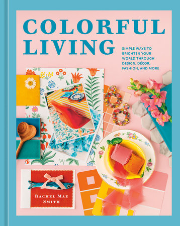
Learn how to use color to create a vibrant living space, a wardrobe you love, and a life filled with wonder in this practical guide from the color expert and DIY maven behind The Crafted Life.

Color can influence your feelings, affect your moods, control how you interact with your home, and even change how you feel about yourself. In Colorful Living, writer, photographer, and professional color consultant Rachel Mae Smith explains why color is so powerful and how you can use it to brighten up your world.

After a fascinating (and painless!) introduction to color theory, Rachel takes you step by step through your home (walls, furniture, decor, art), your closet (clothing, jewelry, shoes, accessories), and other aspects of your lifestyle, sharing simple, creative, and fun ways to add pops of your desired colors everywhere. Identify your favorite shades and create a calming reading nook, a power outfit, or an entryway that makes guests feel welcome.

Easy-to-follow exercises help you define your personal color palette and inspire you to harness the power of color in your life. Rachel's ideas are accessible, affordable, and designed for longevity—because when you mindfully choose items based on colors and styles that make you happy (versus those that social media says you should buy), you're more likely to love what you have.

This one-of-a-kind, vividly illustrated guide to color will help you liven up your life, whether you love chartreuse, light gray, hot pink, haint blue—or all four at the same time.
© Allie Provost
Rachel Mae Smith is the author of The Crafted Life blog. Her work has been featured in HGTV Magazine, Better Homes & Gardens, and Good Housekeeping, and on Today online, Apartment Therapy, Refinery29, BuzzFeed, Domino, and more. One of Pinterest's most promising creators in 2022, she has consulted with brands including West Elm, Michaels, Lowe's, Marie Kondo + The Container Store, Rit Dye, and HP. View titles by Rachel Mae Smith
Life Without Color

Here’s a secret about me: I wasn’t always obsessed with color. In fact, I was passive about it for much of my life. Don’t get me wrong, I’ve always liked color. I just never paid attention to it, how it appeared in my life, or how it made me feel.

You may know me from my current work as the blogger behind The Crafted Life and assume that my life has always been full of color, that color just comes naturally to me and I don’t have to think twice about it. But for those of you who aren’t familiar with my work: Hi, I’m Rachel, and I’ve created and shared accessible DIY projects to add color to people’s lives for the past ten years.
What started off as a hobby eventually grew into my full-­time job. I owe a lot of my ability to make a career with color to being in the right place at the right time during the earlier days of the internet, but I also owe my success to shifting from creating just for fun to being mindful about color.

But one day while window shopping at a gift shop down the street, I came across a pack of Pantone postcards. If you’re unfamiliar with Pantone, the company is best known for establishing a color system that acts as a universal language of color. People who work in design (fashion, graphic, printing, and so on) use the Pantone system to make sure the artist and manufacturer are using the same colors. Think of it like a well-­indexed and expansive library of colors.

I had never seen anything like these postcards before. They were in a yellow box with one hundred color chip cards inside. On the back of each card was a place to write a note to mail to a friend or loved one. That pack of postcards made me feel a brand-­new sense of excitement at the very core of my person, and I knew I had to have them. It was as if I had suddenly developed a creative interest that I had to explore. I scraped together the twenty dollars and took them home, excited to see more of the colors inside.

At the time, I didn’t think anything special about the purchase; I just loved to fan out the color chips on my desk so I could see them all at once. Some colors, like cactus flower and chartreuse, I had forgotten existed in the world. And it wasn’t because I hadn’t seen them before, but rather that I didn’t think about them, well, ever. I also found myself being drawn to colors for the first time in my life. There were so many shades beyond the classic ROYGBIV (if you don’t remember, that’s an acronym for the colors of a rainbow: red, orange, yellow, green, blue, indigo, violet). Who knew I could feel so much excitement about a particular shade of mustard yellow? The colors I thought I loved at the time turned out to be the least exciting part of the deck for me. And that’s when I started to question things. What even was my favorite color? Why didn’t I remember that chartreuse is so beautiful? That deck sparked something; it changed my relationship with color.

I started taking those cards with me on walks around my new neighborhood to color hunt. I would choose a card and then try to find that card’s color out in the wild without any planning or wanted to live. Now, after years of making conscious color decisions, I see the world in a completely different way. Essentially, that twenty-dollar purchase saved my life and changed my entire perspective. Five out of five stars, would recommend.

If you connect to the place in which I found myself years ago, you certainly aren’t alone. Maybe you’ve moved to a new city and don’t quite love it yet. Maybe you’ve lived somewhere for a long time and feel disconnected from your community. Wherever you are in this moment, in your life, I hope it’s somewhere good. And if it’s not, that’s okay too. That just means there’s room for growth, and I believe color can help you get there.

If you’re just starting your own journey with color, I’m jealous! There’s so much for you to explore and learn. To keep you from getting overwhelmed, I’ve taken the steps I took over the course of years and reduced them to my favorite tips and exercises so that you can start to find your own color connections faster. Feel free to work through these pages one section at a time. Or just pick a page at random whenever you have the time and energy to flip through for some quick color inspiration. Work at your own pace and do what’s best for you.

I wrote this book to help you practice choosing yourself and what you like instead of what you think might be the safer option. If that’s a rainbow-­filled home, amazing. If it’s calming neutrals you crave, let’s find the ones that bring you peace. As you turn these pages, I hope they bring you closer to choosing excitement, inspiration, and joy over whatever feels expected. Or maybe it will just help you be in the moment and see your surroundings in a completely different light. Life is too short not to have fun—especially with color. So, let’s get to it.

Xo, 

Rachel

Photos

additional book photo

About

Learn how to use color to create a vibrant living space, a wardrobe you love, and a life filled with wonder in this practical guide from the color expert and DIY maven behind The Crafted Life.

Color can influence your feelings, affect your moods, control how you interact with your home, and even change how you feel about yourself. In Colorful Living, writer, photographer, and professional color consultant Rachel Mae Smith explains why color is so powerful and how you can use it to brighten up your world.

After a fascinating (and painless!) introduction to color theory, Rachel takes you step by step through your home (walls, furniture, decor, art), your closet (clothing, jewelry, shoes, accessories), and other aspects of your lifestyle, sharing simple, creative, and fun ways to add pops of your desired colors everywhere. Identify your favorite shades and create a calming reading nook, a power outfit, or an entryway that makes guests feel welcome.

Easy-to-follow exercises help you define your personal color palette and inspire you to harness the power of color in your life. Rachel's ideas are accessible, affordable, and designed for longevity—because when you mindfully choose items based on colors and styles that make you happy (versus those that social media says you should buy), you're more likely to love what you have.

This one-of-a-kind, vividly illustrated guide to color will help you liven up your life, whether you love chartreuse, light gray, hot pink, haint blue—or all four at the same time.

Author

© Allie Provost
Rachel Mae Smith is the author of The Crafted Life blog. Her work has been featured in HGTV Magazine, Better Homes & Gardens, and Good Housekeeping, and on Today online, Apartment Therapy, Refinery29, BuzzFeed, Domino, and more. One of Pinterest's most promising creators in 2022, she has consulted with brands including West Elm, Michaels, Lowe's, Marie Kondo + The Container Store, Rit Dye, and HP. View titles by Rachel Mae Smith

Excerpt

Life Without Color

Here’s a secret about me: I wasn’t always obsessed with color. In fact, I was passive about it for much of my life. Don’t get me wrong, I’ve always liked color. I just never paid attention to it, how it appeared in my life, or how it made me feel.

You may know me from my current work as the blogger behind The Crafted Life and assume that my life has always been full of color, that color just comes naturally to me and I don’t have to think twice about it. But for those of you who aren’t familiar with my work: Hi, I’m Rachel, and I’ve created and shared accessible DIY projects to add color to people’s lives for the past ten years.
What started off as a hobby eventually grew into my full-­time job. I owe a lot of my ability to make a career with color to being in the right place at the right time during the earlier days of the internet, but I also owe my success to shifting from creating just for fun to being mindful about color.

But one day while window shopping at a gift shop down the street, I came across a pack of Pantone postcards. If you’re unfamiliar with Pantone, the company is best known for establishing a color system that acts as a universal language of color. People who work in design (fashion, graphic, printing, and so on) use the Pantone system to make sure the artist and manufacturer are using the same colors. Think of it like a well-­indexed and expansive library of colors.

I had never seen anything like these postcards before. They were in a yellow box with one hundred color chip cards inside. On the back of each card was a place to write a note to mail to a friend or loved one. That pack of postcards made me feel a brand-­new sense of excitement at the very core of my person, and I knew I had to have them. It was as if I had suddenly developed a creative interest that I had to explore. I scraped together the twenty dollars and took them home, excited to see more of the colors inside.

At the time, I didn’t think anything special about the purchase; I just loved to fan out the color chips on my desk so I could see them all at once. Some colors, like cactus flower and chartreuse, I had forgotten existed in the world. And it wasn’t because I hadn’t seen them before, but rather that I didn’t think about them, well, ever. I also found myself being drawn to colors for the first time in my life. There were so many shades beyond the classic ROYGBIV (if you don’t remember, that’s an acronym for the colors of a rainbow: red, orange, yellow, green, blue, indigo, violet). Who knew I could feel so much excitement about a particular shade of mustard yellow? The colors I thought I loved at the time turned out to be the least exciting part of the deck for me. And that’s when I started to question things. What even was my favorite color? Why didn’t I remember that chartreuse is so beautiful? That deck sparked something; it changed my relationship with color.

I started taking those cards with me on walks around my new neighborhood to color hunt. I would choose a card and then try to find that card’s color out in the wild without any planning or wanted to live. Now, after years of making conscious color decisions, I see the world in a completely different way. Essentially, that twenty-dollar purchase saved my life and changed my entire perspective. Five out of five stars, would recommend.

If you connect to the place in which I found myself years ago, you certainly aren’t alone. Maybe you’ve moved to a new city and don’t quite love it yet. Maybe you’ve lived somewhere for a long time and feel disconnected from your community. Wherever you are in this moment, in your life, I hope it’s somewhere good. And if it’s not, that’s okay too. That just means there’s room for growth, and I believe color can help you get there.

If you’re just starting your own journey with color, I’m jealous! There’s so much for you to explore and learn. To keep you from getting overwhelmed, I’ve taken the steps I took over the course of years and reduced them to my favorite tips and exercises so that you can start to find your own color connections faster. Feel free to work through these pages one section at a time. Or just pick a page at random whenever you have the time and energy to flip through for some quick color inspiration. Work at your own pace and do what’s best for you.

I wrote this book to help you practice choosing yourself and what you like instead of what you think might be the safer option. If that’s a rainbow-­filled home, amazing. If it’s calming neutrals you crave, let’s find the ones that bring you peace. As you turn these pages, I hope they bring you closer to choosing excitement, inspiration, and joy over whatever feels expected. Or maybe it will just help you be in the moment and see your surroundings in a completely different light. Life is too short not to have fun—especially with color. So, let’s get to it.

Xo, 

Rachel