IntroWhen I was a kid, before my family took a road trip my dad would become obsessed with packing the trunk of the car. He could have just thrown everything in the back, but to his mind, the packing must be done efficiently, and he took it as a personal challenge to figure out the best way possible. He typically started by assembling all of the luggage on the driveway, and assessing each piece by its size, shape, weight, and importance—among other considerations: Could it be folded, deflated, bent, twisted, or otherwise contorted if needed? How accessible would an essential item be in the event of an emergency? Would the contents spoil before we reached our destination?
As he began to plug the various pieces into the evolving puzzle of the trunk, my dad would periodically stop and rearrange things to improve the fit. Gradually, the solution became clear as he put the main pieces into place, before filling any remaining gaps with the smaller, more trivial items. Mind you, the contents of every suitcase, toiletry bag, and insulated cooler were packed with just as much thought and care. It all seemed a little excessive at the time, so I didn’t fully appreciate how closely I stood to greatness: the man was a maestro. Little did I know how much those moments would eventually impact me.
In a way, this book is also about organizing things. Shapes are assembled to form letters, letters are combined to make words, and words are arranged to create a message. The size, shape, weight, and ultimate arrangement of each element ultimately affect how effectively the job gets done. The role of words is often more than simply an informative one: words can also entertain, influence, and incite. Yet, the message is only half of the equation: the logos, advertisements, and headlines that compete for our attention every day depend on well-made letters to attract and persuade us. Hand-drawn words, in particular, can elicit emotion, provoke action, and even challenge opinion—apart from simply promoting an idea or selling a product. (Though they’re pretty good at that, too.)
The Latin alphabet has remained largely unchanged for centuries, but that hasn’t prevented people from taking it down a few aesthetic detours along the way. Shifts in trends, technology, fashion, and thinking have all affected the appearance of our letters. Over time, different attitudes and ideas have become associated with certain styles. Consequently, collective notions and expectations have emerged about letterforms and their uses. For example, delicate flourished scripts are thought to exemplify elegance and sophistication, while bold, blocky faces embody strength and simplicity. This is testimony to the fact that the alphabet can provide a voice to words beyond literal communication. The key to making engaging lettering is tapping into these commonly held ideas to connect with people.
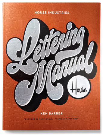
At House Industries, our design approach has been built on the practice of exploiting the versatility of the alphabet by injecting our work with a heavy dose of custom letterforms. We discovered that the secret to creating successful lettering is to pay equal attention to both the message and the means by which you express it. In other words, how you say something is just as important as what you’re saying. This book illustrates how we at House Industries have capitalized on the distinct advantages of lettering to develop a unique brand of visual storytelling, and how you can develop your own approach to creating and executing letterforms in various design settings.
In Part 1: Lettering Basics, I lay the foundation for solid lettering practice. I introduce the various ways to make letters, emphasize the benefits of drawing, explain sources of inspiration, illustrate the anatomy of letterforms, cover basic tools, and outline the method of lettering by reinterpreting standard models.
I take a closer look at the nuts and bolts in Part 2: Lettering Technique. In this section, I delve extensively into the fundamentals that govern the creation of good lettering. You will learn how to sketch effectively, construct letterforms properly, compose layouts, pair complementary letter styles, proof artwork, and dodge common lettering pitfalls.
The rubber really meets the road in Part 3: Lettering Models, where I’ll get you acquainted with the common letter styles that serve as the basis for lettering, including examples of the House Industries working process that ultimately demonstrate how to put the precepts of this book into practice.
The
House Industries Lettering Manual not only provides you with the fundamentals of letter-making, it also uncovers all of the tips, tricks, and techniques that we have stockpiled over the course of twenty-five years in business. Throughout the book you’ll find bonus sections, including instructive skill-building exercises, informative sidebars, and case studies detailing the thinking behind many real-world projects. Whether you’re new to drawing letters or a grizzled vet, you’ll profit from the detailed strategies outlined in these pages. In addition to attaining a firm foundation of sound lettering principles and practices, you will gain insight into the unique perspective on inspiration, craftsmanship, creativity, and personal style that continues to feed our unending fascination with the alphabet.
Unfortunately, we can’t guarantee that your trunk-packing skills will improve—that is a true art.
—Ken Barber
Copyright © 2020 by Ken Barber. All rights reserved. No part of this excerpt may be reproduced or reprinted without permission in writing from the publisher.


